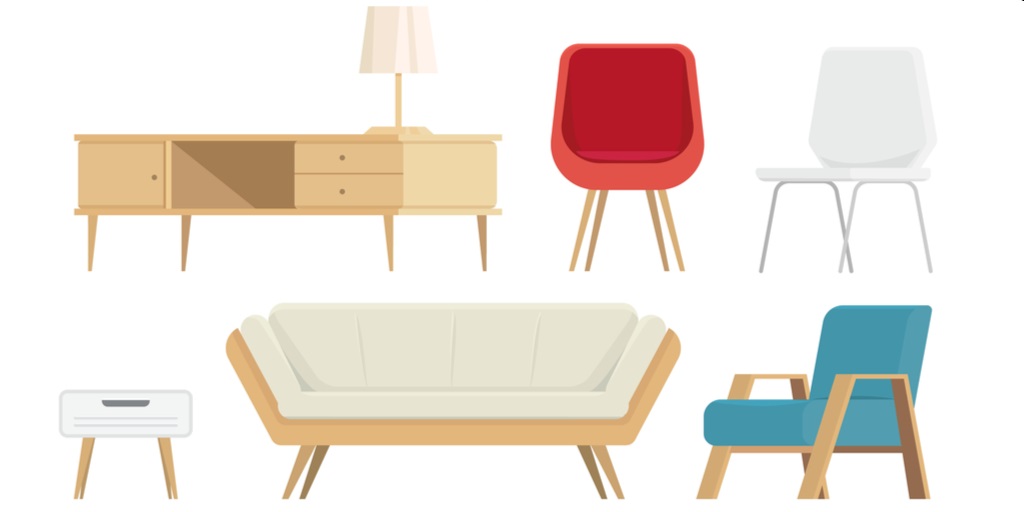
Mid-century Modern Furniture
Has an free-form table caught your eye? Maybe a coconut or tulip chair you’ve seen has burned into your brain.
If you just can’t shake visions of clean lines, simple surfaces and neutral colors with a pop of burnt orange or teal, the Mid Century Modern style has captured you.
You want to keep your home uncluttered, filled with pieces that are both comfortable and functional. Upholstered with neutral-colored fabrics and held by thin, angled legs, this furniture invites relaxation. Throw pillows, rugs and wall art with clean geometric designs and repeating themes add pops of excitement around the room.
As we discuss on our home page, the popularity of Mid Century Modern furniture has been multiplying, particularly since AMC’s Mad Men featured the design starting in the early 2000s.
But its aesthetic appeal is just one aspect driving this interest.
Knowing about the dramatic shift in values and social trends in the 1940s through the 1960s that shaped this style adds an important dimension to the appreciation of Mid Century Modern furniture.
How Simple & Functional Trumped Impressive
Mid Century Modern Furniture designers dramatically departed from their predecessors’ standards. Where once a chair or couch conveyed class, the designers of the 40s, 50s and 60s shifted hard to prioritizing the inherent beauty in natural materials and new shapes, as well as everyday functionality and comfort.
Consider this size of the chair below. Inspired by values of the Georgian period (1714 – 1830), it is large and imposing with curved feet and arm rests. It’s many buttons conveys the owner’s wealth. The high back reinforces the owner’s importance. It’s almost a throne!
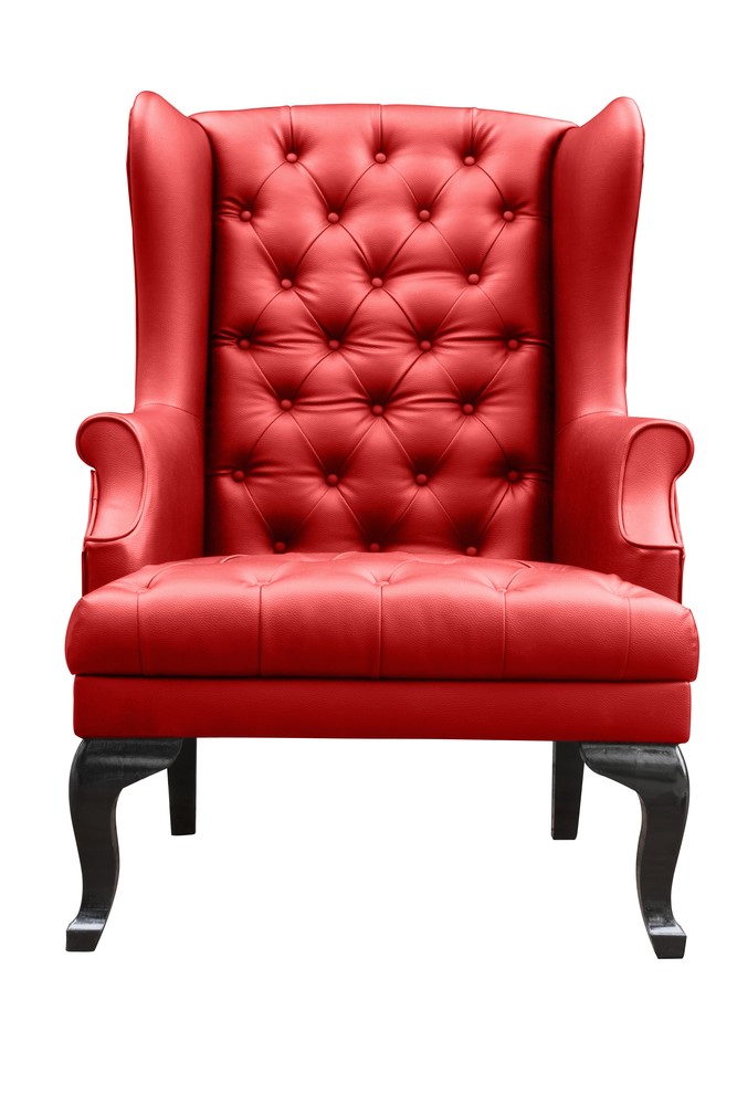
Of course, only royalty and aristocracy had pieces like this. The chairs first appeared in the royal halls where they set the standard. Social climbing aristocrats then hired the designers and builders to replicate these pieces for their own lavish halls and castles.
Moving to the Victorian period (1837 – 1901), we see what the furniture sacrifices in size, it compensates for with detail. The filigree so common in Victorian era furniture conveys that the owner could afford another 20 hours of work on just one chair.
Again, this furniture lived only in the great halls and palaces of Europe and Britain, and maybe the wealthiest homes in the United States. The working classes made do with the simplest, homemade furniture.
In the first half of the 1900s, two brutal World Wars changed the social landscape drastically. At the end of World War II, United States government programs encouraged designers and architects to create affordable homes for the soldiers coming home from the World War II. The homes needed to be appealing but affordable. Their furniture needed to be comfortable, practical—and attractive only third.
These architects and designers, wanting to bring beauty to the masses, focused on shape and the inherent beauty in natural materials to keep their creations affordable. After all, new materials created during the turn of the century and improved during World War II meant that lovely furnishings were no longer limited to the upper classes.
With soldiers and their families safely housed in suburbs like Levittown, NY and Oak Park, IL, and many put to work by the federal government, the middle class began expanding. The Babyboom generation was to the largest age-group in the history of the United States.
Architects and designers finally had an opportunity to deliver their products to a huge audience. More, however, the creatives in the United States came to believe that the fewer the class distinctions the better. With a violent past behind them, they looked to the future to start anew with an entirely new style.
Leaving massive and ornate behind them, designers stripped down their creations. Chairs, tables, beds and more became simple and useful rather than intimidating and ornate. Their beauty lay in focusing on the shapes and repetitions the natural materials themselves afforded.
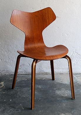
Arne Jacobsen’s Ant Chair showcased the inherent grains in the wood rather than any additional ornamentation. New technologies allowed for the mass production of molded wood and veneers that were lovely but affordable. The clean lines intended to evoke relaxation, rather than intimidation.
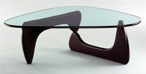
Similarly, Isamu Noguchi’s renowned freeform coffee table maximizes the open space in the home by using glass and just three support points. The new values dictated that the home was for relaxation and family time rather than a showcase displaying wealth and achievement.
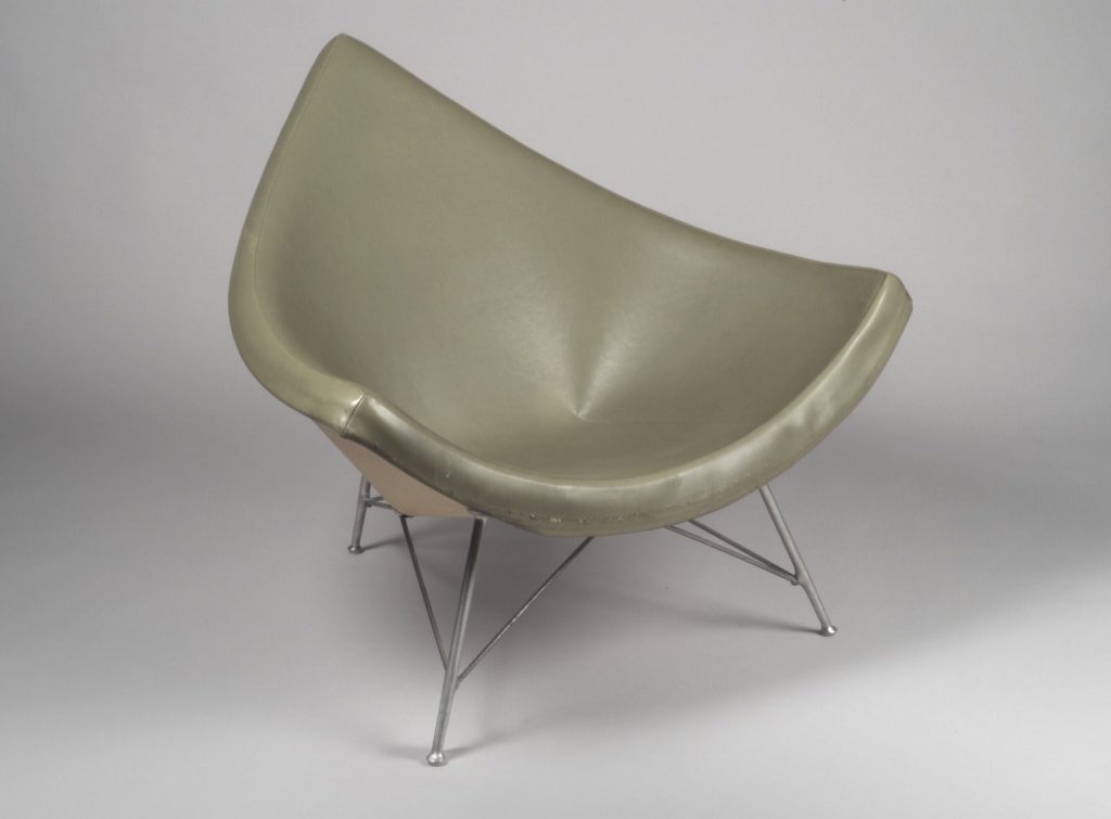
Mid Century Modern designers switched beauty from what one could apply onto the outside of the shape to the shape itself. This coconut chair by George Nelson (named because it resembles a broken shard of coconut) forces the viewer to appreciate its smooth sweep from edge to edge.
Charles and Ray Eames
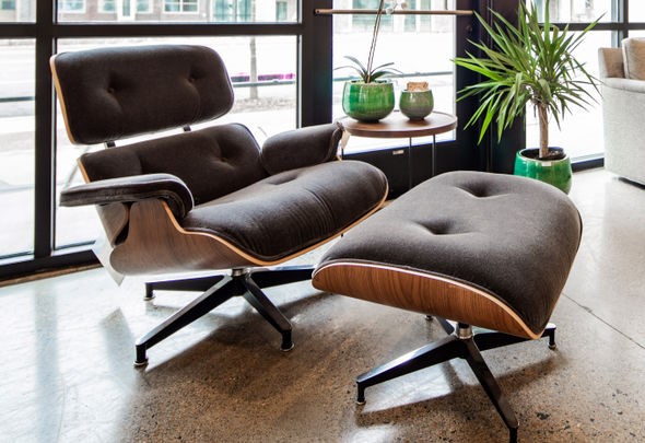
The design team of Charles and Ray Eames possibly had the most influence on Mid Century Modern furniture design in the 20th century. Their lounge chair emphasized comfort, simplicity and natural materials. The free-floating base not only balances the chair, it helps create the spaciousness designers of the time insisted upon.
The Eames spearheaded the use of molded plywood in furniture design. Molded plywood expressed the modern aesthetic: clean, simple lines that were often curved. Read more about the Mid Century Modern power couple here.
Harry Bertoia
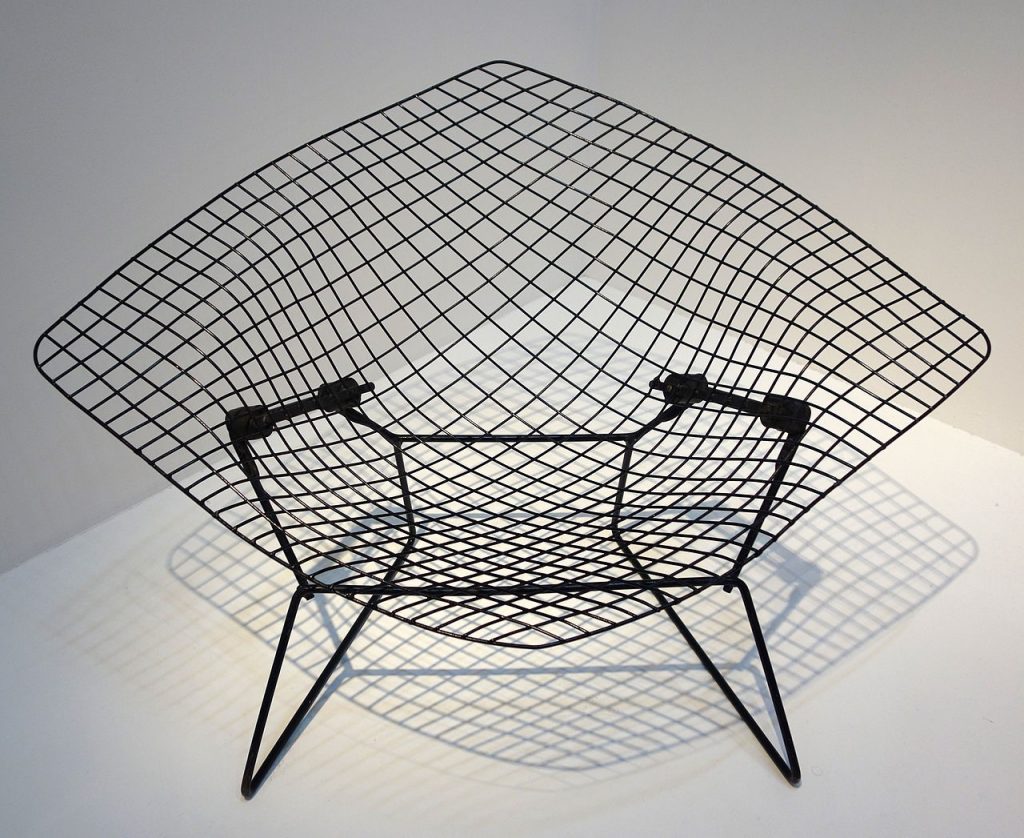
Harry Bertoia worked with metal to create a useful chair with few materials. Even he remarked that his Diamond chairs were so minimal they were, “mainly made of air, like sculpture. Space passes right through them.” This chair became so popular, Bertoia was able to retire to create “sound sculptures.” He arranged metal rods on bases and played them with his hands. His “Sonambient” recordings are collectors items today.
Florence Knoll
No discussion of Mid Century Modern furniture is complete without bringing in Florence Knoll. Her designs helped her start renowned Mid Century Modern furniture company Knoll.com with her husband Hans Knoll. She studied under pioneering architect Ludwig Mies van der Rohe at the Cranbrook School, where many Mid Century Modern designers got their start.
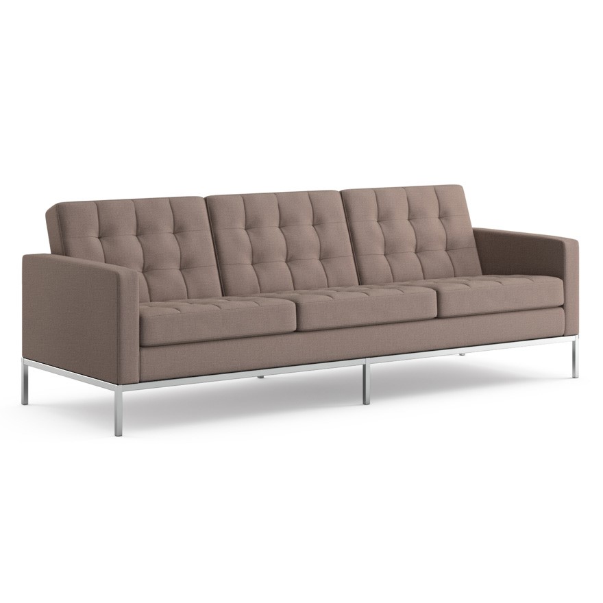
With thin legs and a simple form, this Florence Knoll sofa achieves the free-floating feel that helps create a comfortable, relaxing home. Photo courtesy of www.knoll.com.
Mid Century Modern Furniture Characteristics
Where once complexity created beauty, by the 1940s most homeowners found beauty in simplicity and minimalism. The shift in perception is drastic. If you resonant with these values, the Mid Century Modern style is sure to keep you happy at home.
When hunting for Mid Century Modern furniture, keep these characteristics in mind.
Exterior Natural Features Belong Inside
With a new focus on the environment surrounding the home, architects worked to incorporate home sizes and shapes into the landscape. Designers picked up on this theme by bringing the natural materials surrounding the home inside.
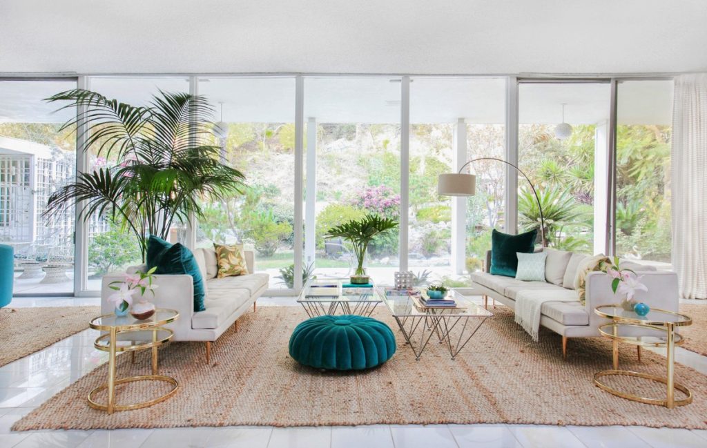
Their first step was to open up the home to the nature outside. It was the first time plate glass was widely available and affordable. Designers incorporated large windows in order to bring the colors, textures and shapes existing outside into the interior. They then replicated these elements in interior decor.
Minimalism & Spaciousness
To force a break with a violent, status-obsessed past, homeowners shifted to clean, modern, even futuristic style. They rejected overstuffed, ornate furniture in over-filled rooms for carefully selected, simple pieces that required little maintenance. Rather than filling every wall space and corner, rooms had only the number of pieces necessary for the family.
With a view like this, all furniture must fade into the background. Its practical function is to keep homeowners comfortable as they appreciate the scenery. Mid Century Modern designers knew that, sometimes, constructed design just can’t compete with nature.
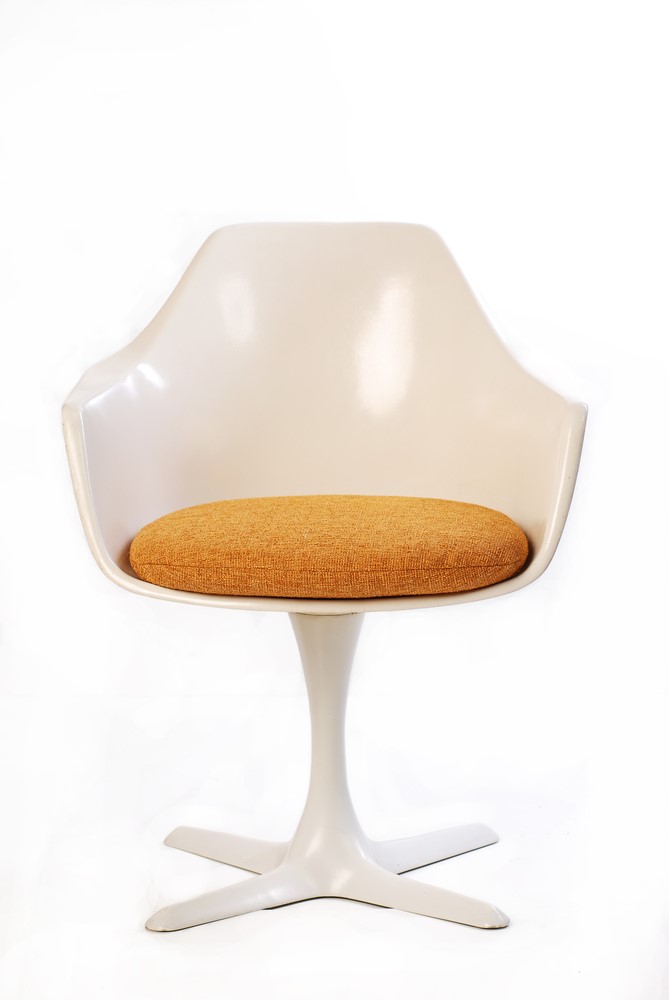
Another way to create a sense of spaciousness is to reduce chair legs from four to one or make the legs thin. This tulip chair, first designed by Eero Saarinen, used the new plastic molding technology to reduce a chair to its most useful components—the seat and one leg reaching a base.
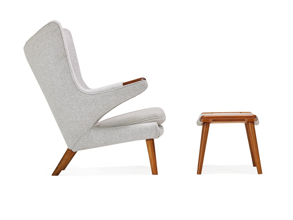
Couches, chairs and tables with narrow, angled legs also gave rooms a sense of spaciousness.
A Focus on the Beauty of Natural Materials
Wood, leather, metal and glass figure prominently in Mid Century Modern furniture. It’s these materials in the raw, rather than ornamentation that captured the eye of designers and their clients. The ever-popular Eames Chair showcases the beauty of leather and wood grain.

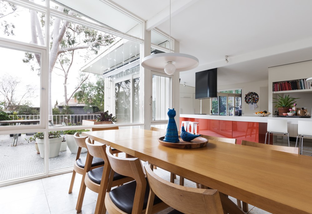
Wood grain is the star of the show in this dining room.
Function Over Form
Tasked with getting beautiful but practical furniture to the growing middle classes, Mid Century Modern designers ensured pieces were lightweight, comfortable and even stackable to conserve space. They also wanted the unique shapes and textures of natural materials they used to stay free of clutter. This means furniture is multi-purpose, equipped with hidden drawers and spaces for hiding away papers.
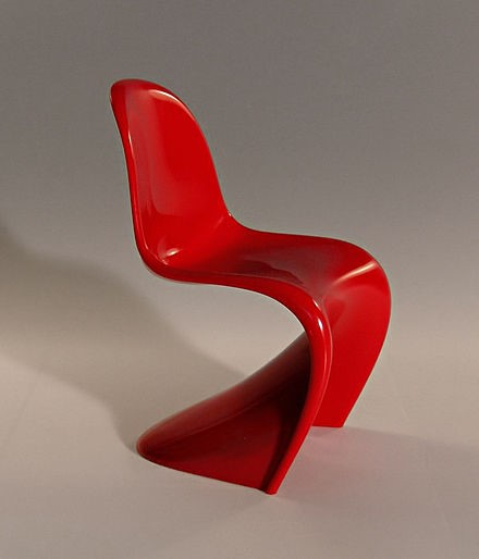
This chair by Mid Century Modern furniture designer Verner Panton used single-injection molding to create a lightweight, stackable chair with a sweeping shape. Its inspiration was the human tongue.
Unique Shapes and Patterns
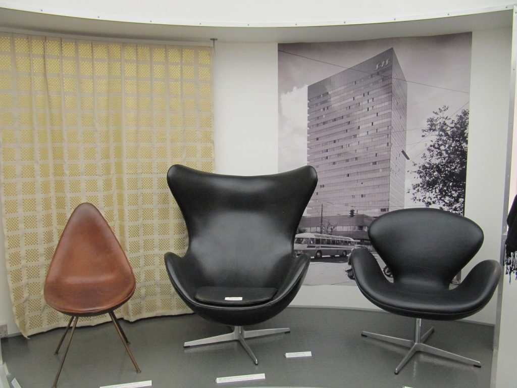
In the Mid Century Modern era, curvilinear and freeform shapes began to get some respect. Arne Jacobsen’s Swan, Egg and Ant Chairs display how minimal and sweeping a chair can get.
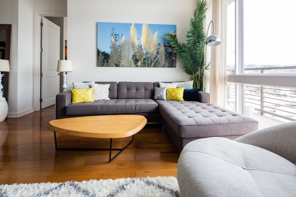
Tables, too, become more oblong or curved triangular with light bases. The Isamu Noguchi table mentioned above represents this trend, too. The curves lend a softer, less imposing feel to the room. Since the home became the place for relaxation and rejuvenation, it makes sense that more designers began to rely on more feminine shapes.
Mid Century Modern Color
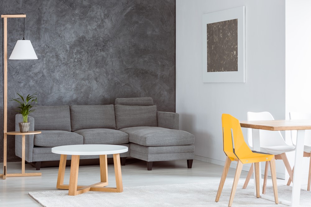
Captivated by the environment, Mid Century Modern designers liked to stay with neutral colors accented by one bright pop of color. Too many vibrant colors would be oppressive and overly complex, reducing the sense of spaciousness.
Most of the furniture of the days was upholstered in grays, beiges, black and white. The pop of color they chose, however, would often be a bright teal, mustard, orange or red.
Appreciating Mid Century Modern Furniture
Now that you know the features of Mid Century Modern furniture design, the next question you want to ask yourself is: are you a collector or an enthusiast? The trends favor both.
Collectors seek the original pieces created by the visionary designers working in the 1940s through 1960s. Charles and Ray Eames, Arne Jacobsen, George Nelson, Harry Bertoia, Florence Knoll, Edward Wormley, Eileen Gray and Isamu Noguchi all designed furniture that was lightweight and simple with clean, flowing lines, often formed into either geometric or free-form, organic shapes. You can read about all the most prominent designers’ backgrounds and styles on our sister site midcentury.org.
Originals fetch far higher prices than reproductions, but they appreciate in value. You can get a good idea of prices by going to the auction house sites. They list their estimates and the resulting price won on many pieces. Find a list of the top auction houses here.
Collectors know the “original,” “genuine” or “vintage” furniture they’re buying is old, but the historical value and investment makes the purchase worth it. On the ecommerce furniture websites and the auction websites, an “original” Mid Century Modern listing contains its build date.
Mid Century Modern Furniture Enthusiasts Can Buy Quality, Too
Just like the look and don’t need the history? Buying reproductions is a smart strategy, too. Stores like Modern Source and All Modern label their pieces “reproductions.” Where an original George Nelson Coconut Chair recently auctioned for $5,000, Modern Source’s reproduction goes for $1,100. An Eames Chair reproduction today will cost $1,200 to $1,500, but an original fetches $5,000 to $7,500.
Those who’ve studied up on the elements of Mid Century Modern furniture can also take their knowledge with them to estate and yard sales. Perusing online sites like Craigslist and Ebay may also turn up some finds.
